Have you ever had a conversation with your digital agency and not understood half of what they said?
There's so much technical language and jargon in web design that it can sometimes be easy for us to forget that not everyone knows the terminology.
So, here's a glossary of some important web design terminology and definitions that you might not be familiar with, along with easy explanations of what they mean.
Web design terminology and definitions
301 redirects
301 redirects are essential if you're redesigning or moving a website. These redirects tell users and search engines that the content that was previously on one URL, can now be found on a different one.
So if you've bookmarked a link on a website that gets redesigned, visiting that same URL when the new website is up and running won't leave you with a "Page not found" error, instead the 301 redirect will take you to the appropriate page on the new website.
And it means that all the SEO value the old page had built up will get passed over to the new URL too.
That's why 301 redirects are a vital part of any website launch checklist.
404 page
404 pages help users who've managed to find a URL on the website that doesn't exist.
If someone has managed to get to a nonexistent page, you don't want them to simply find something that's broken.
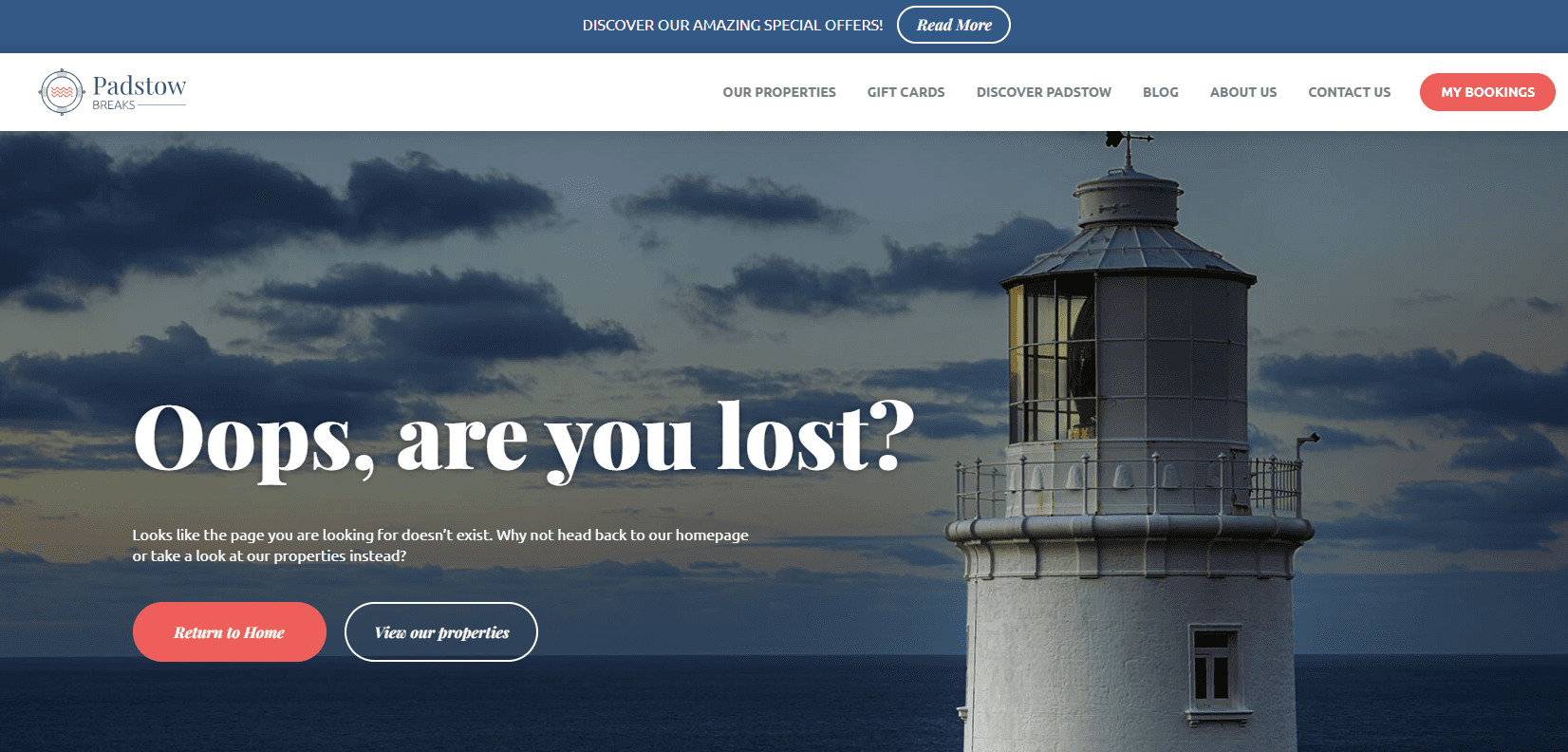
Instead, you create a 404 error page that helps them get back to the main website. By designing these properly, they still feel part of the website brand and experience, and also give the user clear paths to get back to the content that matters to them.
You can even have a bit of fun with them - here's one we created for one of our clients, Padstow Breaks.
Accessibility
When we talk about accessibility in web design and development, we're talking about how to make your website easy to use for everyone, including people with disabilities, visual impairments and physical and mental difficulties.
The first step in accessibility is to apply W3C standards, but there are lots of other ways to make your project accessible, from using straightforward language to ensuring there's enough contrast between your text and your background colours and images.
Agile
This is actually a methodology for how people work on a project. It applies to a huge range of different types of project - including website design and development.
With an agile development process, we don't think of a project as a linear process, instead it involves a lot more collaboration as well as feedback loops. This creates a flexible framework, allowing room for adaptations and changes to the original specification or strategy.
ALT tags
Alt tags are used on images, and their purpose is to explain what the image is about and provide alternative text if the image doesn't render correctly. They're really important for accessibility, as it's the alt tag that is picked up by screen reading software so it understands what an image is.
Alt tags are also great for SEO, as they help Google understand your images in exactly the same way.
AMP
AMP stands for Accelerate Mobile Pages, and it's a format for building fast-loading mobile experiences.
Analytics
Analytics refers to the data you can analyse to better understand how people are using their website, usually obtained by adding a tracking code to your web pages.
The most common (and in our opinion - the best!) analytics software is Google Analytics. It's free, it's incredibly powerful and as it's linked to the most popular search engine in the world, it also gives you the data that really matters.
API
An API is an application programming interface. Basically, it's a way to connect two different softwares together. For example, if you want to incorporate a 3rd party software into your website, one of the easiest ways to manage it is through an API.
ARIA
Also known as WAI-ARIA, this is another important way to make your website accessible.
ARIA stands for Accessible Rich Internet Applications, and it's a way of providing additional information to screen readers so they can understand your website better.
Bloat
In web development terms, "bloat" usually refers to a lot of code overhead that slows a website down.
Off the shelf platforms often suffer from code bloat, as they include the code for all the features the platform allows for, whether you're using it or not.
That's why it's so important to make sure that you do pagespeed checks and optimisation on your website - especially if you're using something like Wordpress or Magento.
Breadcrumb
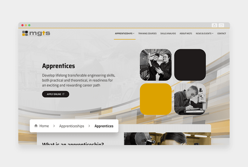
A breadcrumb has two functions on a website, to tell users where they are on the website, and to provide clear steps back to top level pages.
For example, when you're on a page on a website, near the top of the page, but under the navigation and header, you may see something that looks like this
Home > Product Category > Product Name
Breadcrumbs are only needed on pages that are fairly far down the page hierarchy. If you don't have any sub-pages on the website, they're not necessary.
But if you've got subpages underneath your main navigation pages, breadcrumbs are incredibly useful to show users where they are on the website, and to find their way back to the upper level pages.
This helps them stay on your website, both increasing engagement and decreasing your bounce rate.
Breakpoints
When you're creating responsive web designs, breakpoints are the sizes at which the site changes. For example, you have a breakpoint between your desktop and tablet views.
Having multiple breakpoints is essential to a truly responsive website. After all, there's no one single size of monitor, laptop, phone or tablet.
So you need a range of breakpoints that are going to be flexible enough to give a great experience, without trying to create a new design for every possible screen resolution.
Browser
This is what you use to "browse" the internet. The most common browsers are Chrome, Safari, Edge, Opera and Firefox.
When you're designing a website, you need to make sure that you're creating a great experience in a range of different browsers. But don't forget that there are multiple versions of each browser too, and they can all work slightly differently.
Bootstrap
Bootstrap is a framework that can be used to create interface elements in CSS and JavaScript - such as buttons, navigations and forms.
It's an open source format that is most commonly used to create prototypes, as it's quick and simple to create user interface styles without needing much frontend development experience or knowledge.
One of the downsides of using Bootstrap out of the box is that it creates almost identical styling which is easy to spot. It's also bloated (see our entry on "Bloat"), and can be pretty restrictive.
So if you're putting together a prototype, Bootstrap could speed up the process so you can start testing. But when it comes to a finalised product, you'll get more flexibility and performance using bespoke CSS.
Bug
A bug is something that breaks your website. If you click "Add to basket" but the product doesn't actually show up in the basket - that's a bug. If you submit a form and the website breaks - that's a bug.
Sometimes people refer to anything they want to be changed on a website to be a "bug". But a lot of the time you're actually just asking for features to be changed.
So in short, anything that causes a website to break, or prevents you from doing a normal process on the website is a bug. Anything that you'd just like to look or work differently is not.
Cache
Caching is one of the ways that browsers like Chrome and Safari speed up loading times for websites. When you first visit a page, the browser will "cache" it - meaning that it temporarily saves this page just as it appears to you.
This means that the next time you visit that page, so long as the cache still exists, the browser will show you the saved version, which is much faster than reloading the whole page for you again.
There's no set time for a cached page to be kept, it varies a lot between different browsers and settings.
That's why sometimes you won't see that a website has updated without refreshing your browser, or clearing your cache.
Clearing the cache is easy, just hold down "Ctrl" and "F5" if you're using a PC, or "Command" and the refresh button if you're using a Mac.
Call to action (CTA)
A CTA or Call to Action is something that a user interacts with in order to get to the next stage of a process. That could be to visit a new page, to put an item in their basket or to sign up for a newsletter.
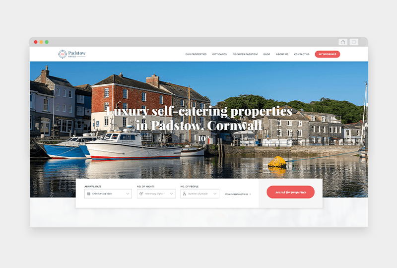
The main call to action on this homepage for Padstow Breaks is to 'Search for properties'
CTAs are really important for the user experience, and are often used to measure engagement on your website.
CMS
CMS stands for Content Management System, and this is the software that you use to update and manage the content on your website.
There are lots of different types of CMS, from bespoke systems that are created just for your website, to off-the shelf platforms and web builder software.
Some of the most popular content management systems include:
Cloud
Cloud services are those that are provided on demand. This can apply to hosting, where instead of being hosted on one physical server, your web files are hosted across a network of servers.
You can also have cloud software, which is sometimes known as SaaS, or software as a service. This usually refers to software that can be used online through a browser or app.
Conversion
In its purest form, a conversion is when someone on your website "converts" from being a visitor to becoming a customer.
The most obvious example of that would be if someone visiting your website completed a purchase on it.
But of course, not all websites work that way, so sometimes a conversion could be someone filling out your contact form, or getting an online quote.
Cookies
Cookies are temporary files that your browser stores. There are lots of different types of cookies, from ones that make your experience on a website smoother, to ones that tailor advertising.
Most websites make use of cookies to help your browsing experience. For example, when you fill out an online form but miss a required field the form may reload.
But cookies can ensure the form has remembered what had been entered in the other fields, so you only have to fill out the box you'd forgotten, not start the entire form again.
Lots of websites also use cookies to track anonymous user information, often through a service like Google Analytics.
This means that a website owner can see data such as how many people have been on the site, what pages they visited and how long they stayed, to help them understand how the website is performing.
CRM
CRM stands for Customer Relationship Management, and usually refers to software that tracks and manages your clients and customers and your contact with them.
There are lots of custom and off the shelf CRM platforms, some that you may have heard of include:
- Hubspot
- SalesForce
- Microsoft Dynamics
- Freshworks
CRO
CRO means conversion rate optimisation, and it's the process of improving your website so that more visitors become customers.
CRO can involve lots of different things, from updates to the design or structure of your website to the way you communicate with customers.
Domain
Your domain is simply your website's address. For example, Edge of the Web's domain is www.edgeoftheweb.co.uk
Favicon
Favicons are the little images that show up in your browser tabs and shortcuts. They're usually a company logo or icon that is unique and easy to identify.
Funnel
Funnels are an important part of marketing, SEO and CRO. A funnel is a visual representation of users at different stages of the sales or marketing process, and shows how they progress.
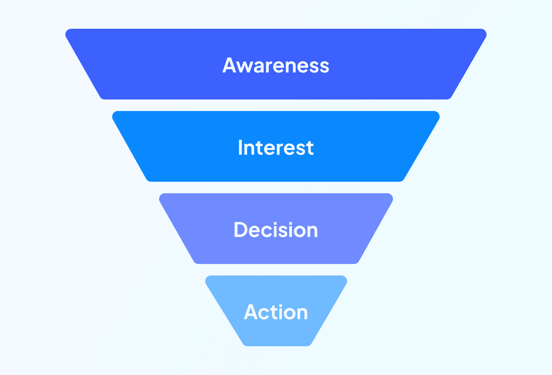
This is an example of a sales funnel
GDPR
The General Data Protection Regulation, or GDPR covers how businesses should store and protect their customers' personal information and data.
It's a common misconception that GDPR is only about online interactions, but actually it covers every aspect of your business, whether you have a customer database or paper records in a filing cabinet.
Hamburger
You've probably seen a hamburger navigation on lots of websites - particularly if you've been browsing on your mobile.
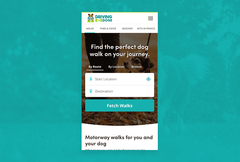
You can see the hamburger icon in the top right corner on this mobile view for Driving With Dogs
The hamburger is the 3 line visual icon that you click to get the full navigation. So-called because it looks like a hamburger in a bun!
Hosting
Very simply, hosting is the service that holds all your website files. In order for your website to be available on the internet, the files need to be hosted on a server that is always running.
HTTP and HTTPS
HTTP means Hypertext Transfer Protocol, but realistically all you need to know is that it's the protocol that fetches resources, like your website files. That's why weblinks start with http or https.
The difference between http and https is that https is the protocol that's used when a website has an SSL certificate for additional security.
Keyword
Keywords are the words and phrases that you want to rank for or are ranking for in search engines.
Identifying the right target keywords for your marketing campaigns is one of the most important parts of SEO.
Landing page
A landing page is a page on your website that people visit directly - usually from organic or paid search results.
Agencies often create dedicated landing pages that are separate from the rest of the website in order to provide a unique experience to users who have arrived on the page by searching for specific keywords.
Lazy load
Lazy loading is a clever way to speed up a webpage by segmenting the points at which content areas load. This means the page isn't trying to load in its entirety as soon as you land on it, which dramatically speeds up the time to first byte.
It's also a good opportunity to create some nice transitions for when the content does load in, making it good for optimisation, but a cool design feature too.
Long-tail
Long-tail keywords are longer, more complex phrases that might not get as much traffic as shorter keywords, but are much easier to rank for. These can be really useful targets for content marketing.
Meta tags, titles and descriptions
Meta tags, titles and descriptions are really important for both SEO and accessibility, as they help you describe to search engines and screen readers exactly what your website is about.
Your meta title and description is usually what Google pulls through onto its search results pages, so they're also important for attracting visitors to your website.
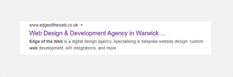
The meta description is the text below the hyperlink displayed in the search results
Minification
When you minify code, you are basically making it smaller, shorter and more streamlined. It's one of the easiest ways to reduce website bloat and improve your website's loading speed.
MVP
Minimum Viable Products are often used when you're using an Agile workflow. MVPs are the starting point for your website or app, and they have only the absolute essential functionality the project needs.
By starting with an MVP, you can analyse how people use it, so that you can decide how best to grow the project based on actual user interaction and feedback.
This is a great way to work on projects with complex functionality, as you won't waste money on features that users don't find valuable.
Navigation
Navigation is how users get around your website. Most websites include a navigation bar at the top of the page, or a hamburger navigation, which you can click to display the full menu.
You can also often find secondary navigation through sidebars, footers and breadcrumbs.
Open source
Open source software is code that is available to be used, changed and updated by anyone. For example, WordPress is open source software that anyone can write plugins for.
O/S, Operating System
Your O/S or operating system is the technology your device operates on. For example, Apple devices run on IOS, whereas PCs typically run on a Windows operating system, and most non-Apple mobile devices use Android.
Page speed
Page speed is how long it takes your webpage to load. It's really important for SEO and user experience. If you leave your users waiting too long to see your page, they're going to leave your website, driving up your bounce rate.
Parallax
Parallax scrolling is a design feature where the background of a website scrolls at a different pace to the foreground elements.
This can be a really subtle way to introduce movement to the site, and keep users engaged as they scroll.
Plugin
Plugins are used on open-source software to add features or functionality. WordPress plugins can do lots of things, from changing the URL of your login page, to helping with your SEO.
Prototype
A prototype is a test version of something. They're usually not fully designed and just use basic functionality.
At Edge of the Web we usually produce prototypes for our web projects so that we and our clients can test the user flow, and ensure that the page structure, content and hierarchy is correct.
Resolution
Screen, or display resolution is the size of your screen in pixels. Screen resolution varies hugely, from large meeting room monitors to small smartphones. This is why it's so important to have responsive design and a range of break points.
Responsive
Responsive websites change for best use on different screen sizes and devices. This isn't just about display, it's also about usability.
For example, good responsive design might require changes in layout to ensure text isn't too overwhelming, or moving buttons so they're easier to reach with your finger while holding a phone.
Rich snippets
Rich snippets are Google listings that pull out additional information based on your website's schema markup.
This can include product prices and availability, user reviews or even knowledge panels.
Robots.txt
This clever little file is used to tell Google how to crawl and index the pages on this domain. It's often used to hide a website that's still in development, so it doesn't get indexed by search engines.
Then once a site goes live, the robots.txt file is updated to tell Google which pages it needs to crawl and instructions for the process.
SaaS
SaaS stands for software as a service, and refers to software that you can access online through an app or browser.
It's also known as on demand software, and is usually accessed through a subscription. Popular SaaS platforms include:
- Google Workspace
- Dropbox
- Salesforce
- SEMrush
- Schema markup
Schema markup
Schema markup is another way to improve how search engines understand your website, and it helps with accessibility too.
Schema markup adds microdata to your web pages and content, to provide extra information that explains what the page is about.
Google often uses schema information to help it create rich snippets and knowledge panels.
Screenshot
A screenshot is when you capture an image of your computer screen. These are really useful if you're encountering an issue with the website, as it can often be really difficult to describe what's going on!
The easiest way to take a screenshot on a PC is to press the Print Screen button, this will copy an image of your screen to your clipboard, which you can then paste into an email to send.
SEO
SEO stands for search engine optimisation, and it's what we call the process of improving your website rankings in search engines.
A little confusingly, an SEO can also refer to a search engine optimiser, so you may come across people who have the job title of SEO or refer to themselves as an SEO.
SERP
SERP simply means search engine results pages, and is used as a shorthand by SEOs.
Server
A server is the hardware that hosts your website files.
Sitemap
A sitemap is a list or representation of the pages on your website. Sitemaps are used for several different things, including planning out the scope of your website for a quote or strategy document.
Sitemaps are sometimes also included on your website itself as a page or section of links, to help people navigate to different pages.
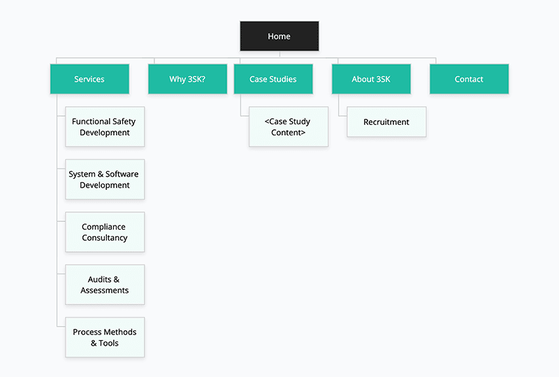
A sitemap helps you understand the hierarchy of your website pages
There's also an XML sitemap, which is really important for search engines. XML sitemaps are created just for search engine crawlers, and provide a roadmap to each page on the website that you would like to be indexed in Google.
SSL
SSL certificates are used to provide an extra level of security on your website. It stands for Secure sockets layer, and encrypts messages to and from the website to protect user data.
Having an SSL certificate will give you the padlock in your browser's URL bar instead of a "Not Secure" message, and also gives you a small SEO boost.
Sticky
In web design, something that's sticky remains in view even when you scroll. It's most often used for navigation bars or notifications, so that they're always present on the screen.
TTFB (time to first byte)
Time to first byte is an important measure of page speed. It's the length of time it takes for the first byte of data to be loaded.
UI & UX
UI and UX stand for user interface and user experience. They're often used interchangeably but they are actually different.
UI is all about the functional elements of your website, and how they look and work. Whereas UX is about how a user interacts with your entire website, including UX writing.
URL
A URL is the full address of a webpage.
Vectors
Vectors are image files that are created using relative points, instead of made out of pixels. It's a complex point, so let's break it down!
Let's say we're talking about a rectangle.
For an image version, the rectangle might have a width of 2 across and a length of one.
But in a vector, the rectangle would have a width twice its length.
So for the image, you can't make the rectangle any bigger, because the width and length are set.
But the vector you can expand indefinitely and keep the quality and proportions, because the length and width aren't based on an absolute size, they're based on their relation to each other.
That's why graphic designers often ask for things like logos as a vector file, so they can be easily resized and reworked to use in different scenarios.
Vector file formats include:
- .ai - Adobe Illustrator
- .pdf - Portable Document Format
- .svg - Scalable Vector Graphics
- .eps - Encapsulated PostScript
W3C
W3C is a set of standards that make websites accessible to as many people as possible, including people with visual impairments or disabilities.
Waterfall
This is an approach to project work where each stage of the project is worked on and then passed to the next department. In web design that often means that the work begins with the designer, when they are finished they pass it to the front end developer, who then passes it to the back end developer.
While this does create a clear structure for project work, it can be more difficult for departments to work collaboratively, or to cope with changes during the project.
Whitespace
Whitespace is what we call the spaces in a website design - they absolutely don't need to be white, and they don't even need to be empty. You often find small graphics or faint images in whitespace to add a little texture.
These gaps are actually an important part of design, as the spacing around content areas and elements makes it easier to draw the eye to the important parts of the page.
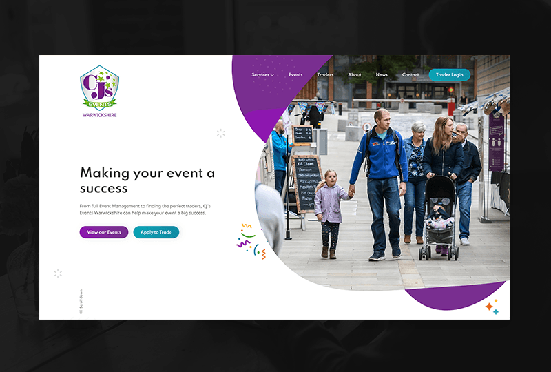
The whitespace on the CJ's Events website helps draw the focus to the CTA buttons
If you filled up every space on a website, all the focal points would be pushed together and difficult to distinguish from each other.
Whitespace is used to break up the main areas on a website, enabling each section to stand out.
Wireframe
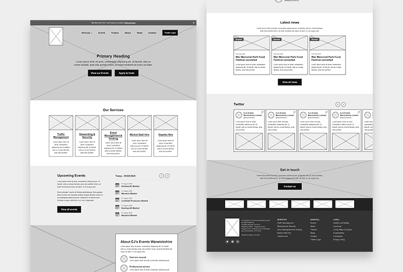
A wireframe is an undesigned, visual representation of a webpage's structure. It works like a blueprint, so you can see what content areas are on the page, where you would see images, and a general idea of how much text there would be in each section.
Wireframes are fantastic for ensuring that you've covered all your important messaging on a page, and that it's all in a suitable hierarchy before you start designing.
Web design jargon explained
So that concludes our glossary of website design words and phrases.
If there's anything you think we should add to our list, please let us know by tweeting us @edgeoftheweb, and we'll see about adding your term to our list.
And if you'd like to talk to an agency that doesn't just deal in jargon, we'd love to hear about your project. So feel free to contact us for a chat!

